If you are constantly playing around in the WordPress post editor, you might find yourself…
For front-end and WordPress developers coding up responsive themes, it can be useful to quickly test your site at a number of viewports. Responsible gives you the ability to do this, right from the admin bar.
What’s it Do?
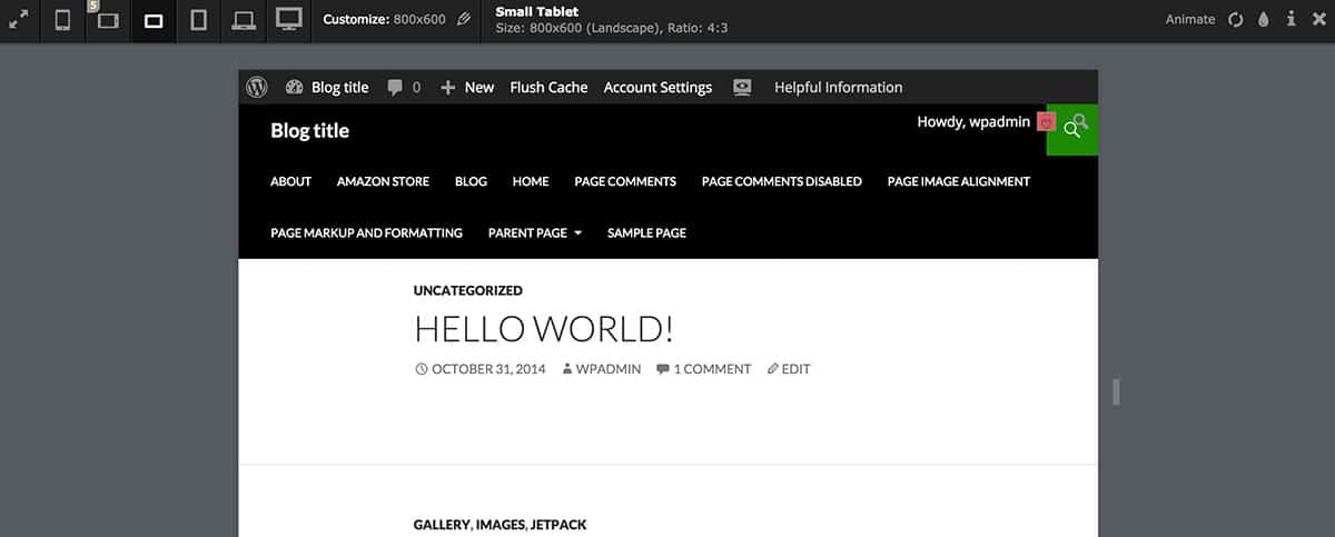
Responsible adds a new tab to the admin bar which opens up a viewport resizer tool. From within this tool, you can select different viewport sizes, and your site will be scaled within your window, without you having to constantly drag the window wider and narrower. You can automatically select from a range of sizes, and see what your site will look like on an iPhone, tablet or full-sized screen just by clicking a couple of buttons. Or, you can select a custom viewport size to see your site in. There’s also an “Animate” option which will gradually shrink your viewport size.
How’s it Work?
After you install and activate the plugin, you will see a new option on your admin bar, an icon of a small laptop with a code symbol in it. Click on this, and a new window will drop-down from the top of your screen. On the left side of this new toolbar, you will see a range of icons representing different screen sizes. This includes a mobile phone, iPhone 5, small Tablet, Tablet, HD screen, and HDTV. Clicking on any of these icons will automatically resize your site within your browser window to that viewport. If you click on any of the icons again, you can switch between landscape and portrait views. As your screen shrinks, your site will respond to different media queries, but your browser window will stay the size, so you can easily flip between. If you want to choose a custom size, just click the “Customize” button and enter a width and height in pixels.

Your options
On the right side of the toolbar are a few more tools available to you. The first is called “Animate”. This will expand your site to it’s largest size, and then gradually start to shrink the size of the site down to a mobile size. This is helpful if you want to see your site across a range of screen sizes all at once. You can also click the “Reload” button to refresh the page within the current size, and the “Print” viewport button to test the print stylesheet for each media query. Other than that, you can close the window out to return to your normal site. It’s a simple plugin, but useful for developers.

Responsible in action
Costs, Caveats, Etc.
Responsible uses “Viewport Resizer” in order to do its magic, which is a pretty rock solid bookmarklet in its own right. The plugin is fairly new but is a good implementation. If you are running into any problems, you can visit the support forums for help.


