A pretty simple and useful plugin, Page Template Dashboard lets see you what templates your…
We live in a Responsive Design world now. If you are working on a WordPress site, you’ll want to test your site at a variety of screen sizes to make sure that your design responds correctly to breakpoints, and your layout doesn’t break. The Responsive Page Tester plugin lets you view any page at different sizes.
What’s It Do?
Responsive Page Tester adds a new option to your admin bar, which allows you to preview your page at different screen sizes in your browser. It’s based on Matt Kersley’s Responsive Design Testing tool, with some new additions. The plugin’s stylesheet and Javascript file are only loaded if you are an admin, so you don’t have to worry about non-admin users being bogged down by excessive code.
It’s worth noting that this plugin is just for testing layout. It will not catch all of the features and functionality of a smartphone or mobile device and has no UA switching. It will simply show what your page looks resized according to certain media queries. It will also not make your design more responsive. That’s your responsibility. It is simply a useful testing tool.
How’s It Work?
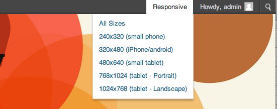
Installing Responsive Page Tester will add a new option to your admin bar when viewing any page on your website labeled “Responsive.” If you hover over this button you will be presented with a list of sizes and the device this size is commonly associated with. For instance, “320 x 480 (iPhone)” and “768 x 1024 (Tablet – Landscape)”.
Select any size to view it responsively
If you click on any of these sizes, your website will be resized within the frame conforming to the width and height you selected. You can navigate through the site just as you would normally, but pages will remain in this frame, so you can see how the layout may look on different devices. Above the frame, the plugin lists what screen size you are currently viewing for a quick reference.
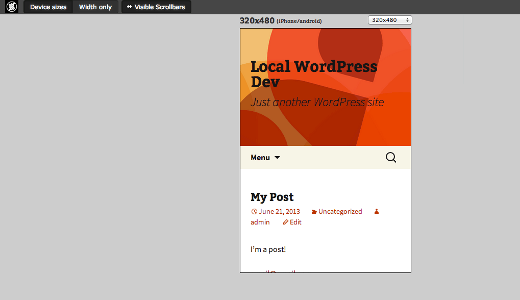
Your site will be displayed in a frame at a specified size
At the top of the screen, you’ll see a few new options appear when you are in testing mode. The first is a toggle button between “Device Sizes” and “Width Only.” Choosing “Device Sizes” will show device width and height, while choosing “Width Only” will show the width of your specified screen size, but with a height of 100%. The other button is “Visible Scrollbars.” This will chrome that’s associated with scrollbars, as some devices take this extra space into account. In the end, it will remove a few pixels from the width so you can make sure your layout remains consistent with or without scrollbars included.
You can switch between sizes at any time by using the drop-down located above your site frame, or by selecting another size from the admin bar at the top. If you are having a bit of trouble with sizing, it’s best to select an option from the admin bar, which will sort of reset the whole thing.
There’s also an “All Sizes” option from the drop-down admin menu. This will show you all of the listed screen sizes at once, side by side. You can add or remove screen sizes from this list, one by one, by selecting the “-” sign next to each screen size listed on the top right of the screen in All Sizes mode.
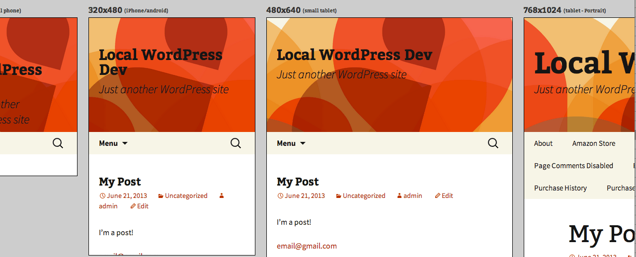
Or you can view all sizes at once
The only other useful feature I found was therpt_screen_sizes filter which allows you to add custom device sizes. The way you do so is:
function mythemename_filter_rpt_sizes( $sizes ) {
    $sizes['955x600'] = array( 'width' => 955, 'height' => 600, 'description' => '(New Size)' ); //Add a size
    unset( $sizes['240x320'] ); //Remove a size
    return $sizes; //Return our filtered sizes
  }

<add_filter( 'rpt_screen_sizes', 'mythemename_filter_rpt_sizes' );
Make sure to change the width and height in the $sizes array to your desired device Size, and change the description to whatever you would like. To remove any size, just list the width x height within your sizes variable.
Costs, Caveats, Etc.
Responsive Page Tester is completely free, and as far as I can tell, the developers have some upgrades in store for the near future. I will say that from some time to time if you are toggling between lots of different sizes, you may see some bugs in the resizing. If this ever occurs, it’s usually just a matter of refreshing the page or selecting a new size straight from the admin bar. I’ve seen this kind of thing happen with a lot of responsive testing tools, and it will only happen if the plugin is really pushed to its limit.
There haven’t been too many questions surrounding the plugin, but you can reach the plugin developers in the Support Forums.