
A business engaged in e-commerce aims to have high conversion rates as it tells how much you are able to make a business out of your site’s visitors. If you have low conversion rates, it means that a lot of your users come and go without doing anything beneficial for you. You should, therefore, make sure that you employ strategies to improve your conversion.
Here are seven mistakes that are often committed against navigation, which you should avoid to improve your conversion rate:
1. Labels and headlines that don’t drive conversions
Your headers are what your site visitors first see. If what you have been unable to pull them in, then you would have an even harder time in converting them. What you should do is to make sure that you highlight important pages, especially those that concern essential items.
Another way that this mistake is committed is by highlighting items that are not related to conversions such as job openings in your company. While it is essential that you have this on your site, you should not give its as much importance as your products or services by putting them on the same level on the menu bar.
The key is to highlight conversion-driving pages over those that do not matter to your customers. You can check the efficiency of each page through the use of e-commerce analytics.
2. Using a non-standardized layout
You are bound to have multiple pages on your site, but your navigation scheme should be consistent throughout your site. Otherwise, it will cause a lot of confusion to your site’s visitors. What you should do is maintain just one intuitive navigation scheme across different pages of our website.

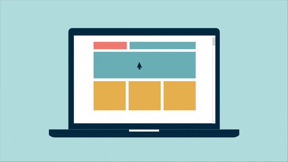
An example of a simple & effective menu layout
This way, your users would not be confused as to how to move on to the next page, or go to a different one.
Some of the guidelines that make great navigation layout are the following:
- The menu should be located on the top of the screen
- The headline should be large enough and easy to read
- Sub-headers should be short and should make sense
- CTA buttons should also look the same
If your layout were different on each page, it would be complicated to move around your site. So make sure that your layout is standardized.
3. Conflicting CTAs
Calls-to-action should be used strategically. CTAs embody the action that you want your users to take. But some end up making a mess out of their CTA, usually making use of too many unrelated CTA buttons.
Make sure that you use the right CTA on the right page. Only with the strategic use of CTA would it be able to bring about the results you are expecting.
4. Too much clutter
Another navigation blunder is having very messy pages, especially those that put in a lot of objects on just a small digital real estate would make your page look very disorganized, and can hurt your conversions significantly.
What you should do is to ensure that your content, and all the objects that you put in your site, are all appropriately organized and that you should make use of a decent amount of white space to allow your pages to breathe.
This will help make your site more inviting and can help you achieve more conversions as compared to having pages that are full of clutter.
5. Not accounting for scrolling
Before, pages are geared to fit into the screen without the need to scroll. However, sites are now adopting a more extended layout, and scrolling has become essential. But as you do scroll, always make sure that you put in the essential items above the fold so that even if the user doesn’t scroll, he will be able to see them. This is especially true for CTA buttons.
Make sure that even when scrolling, the important elements are visible
Make sure that you take into consideration that not everyone will scroll down, and might miss essential parts of your page such as CTA buttons, so you should properly layout your pages, especially if you also follow longer forms.
6. Complicated checkout process
Another aspect of navigation that is sometimes left out is the checkout. Your checkout process should be easy enough to ensure that your customers won’t be turned off at the last moment. The last thing you want to happen is to lose your sales just before the client says so.
Your checkout process should be simple, and should only ask about relevant questions that are necessary to identify the buyer, get his or her address, and his or her payment information. Any more might already by unnecessary.
It is also a good idea to allow checking out as a guest as to not require customers to sign up. A lot of users leave their carts when this happens because it usually asks a lot of information that users would find to be quite troublesome.

Don’t complicate the checkout process
7. Forgetting about mobile users
The final navigation blunder committed is not thinking about mobile users. Mobile users are working on a smaller screen with different hardware, so it is advisable that you put a lot of attention to ensuring that your mobile site is designed correctly. This can easily be achieved by adopting a responsive web design that automatically adjusts to the screen of the device your site is being accessed from.
Always remember that a lot of importance is being given to mobile so it essential that you work on your mobile site in a way that navigation is not an issue.
Improve your conversion by avoiding these navigation mistakes
Navigation is an essential factor of user experience, which significantly affects conversion. It is necessary that you provide your users with smooth and intuitive navigation. Avoiding the seven navigation blunders above is an excellent way for you to achieve that, and as you do, you will be able to boost your conversions to a great extent.