Do you want to make an agency or company, build an online store, and have your brand? For branding, having a unique logo is a must.
A logo establishes a brand for your business, distinguishing it from competitors and allowing it to remain in people’s minds for a long time. That is, in the end, what every company aspires to. It is not enough only to have a good product, but you should have a clean, easily memorizable logo, as well.
Besides your logo, web hosting also can tell a lot about your company, and that is why you should always choose the best one for easier optimization of your website.
So, if you are looking for reliable and affordable WordPress hosting, we have just the one for you. WPMU DEV is fast becoming one of the best choices on the web. Get 20% off any of their fully-managed and dedicated plans.
All of those massive corporations have instantly recognizable logos that generate annual profits as a company symbol. We see “an apple,” and the first thing that comes to our mind is a giant company Apple, one of the most growing and famous companies in the world.

The logo can yield to the increase of sales & profit boost and afflict your company with a significant sales drop. This is why careful planning and building a logo are crucial today.
Okay, let’s build a logo, but you probably ask yourself where to start?
Brainstorming ideas and choosing some forms, colors, typography, and negative space are just tasks that you have to think about right away. This procedure is far more complex than you may believe. However, we will provide you with guidelines or standards to follow when making a logo.
Tip 1: Plan, plan, plan
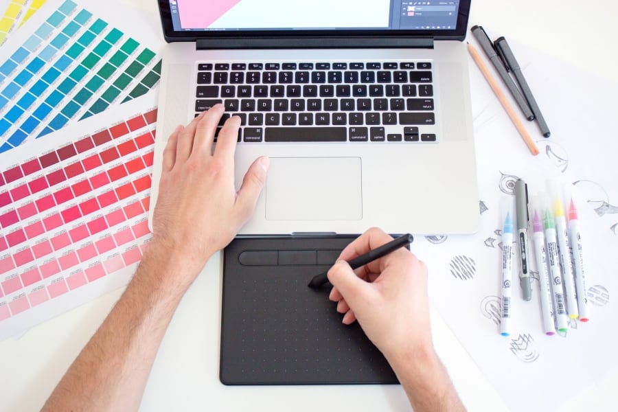
You are not aware of how important the planning phase is in creating a logo. You don’t just start developing a logo in vector graphics software like Adobe Illustrator. Make a strategy, get a pen and paper, and sketch out a quick design of what you want your logo to look like.
Give yourself several possible logo forms that you have in mind and draw them on a piece of paper. The famous designers claim that the most crucial part of logo creation is planning. Without a proper plan, your logo will suffer in quality.
Tip 2: Scaling
When creating a logo, you need to know that you are not only making it look good on a website in a digital form, let’s say. You need to test it out in all possible forms, such as paper, envelope, poster, billboards, TV, etc. The logo might look okay in a digital format, but it can look blurry or unclear if you upscale or downscale it and print it on paper.
Tip 3: The Importance of Colors In a Logo Creation

Picking a color for the logo should not be random. Colors can evoke people’s emotions and feelings. Thus it would be best to be very precise when choosing a color palette. Choose blue, purple, green, and other cool-toned colors if you prefer them. If you require warmer colors, go with a combination of red, orange, and yellow.
Tip 4: What About Typography?
Let’s imagine you pick fonts like Times New Roman or Arial for your logo. Do you think people will like it, and it would look clean? Don’t even think about it! You should devote your entire research to finding the best font for you.
Try different font families, like sans-serif, serif, script, also different styles like bold, medium, italics, etc. The more combinations you try, the better idea you will have on which font suits you best.
We usually encourage using unique typefaces, which you didn’t get a chance to see on other websites. Some large corporations have unique fonts explicitly created for their websites. Also, this all makes you unique and different from others.
Tip 5: Simplify and Do Not Copy Others’ Works!
We talked about so many things your logo should or should not have, right? But, sometimes people go crazy while creating a logo, and they believe in this fallacy that the more stuff you put on the logo, the more impressive and effective it will be. This is so wrong, and please do not make this mistake.
If you look up and check the logos of these giant companies like Google, Apple, eBay, you will see how crazily simple they are. Keep your logo as simple as it could be and stick with that.
Similarly, you must have the perspective that it is never acceptable to replicate current logos. You take a logo, tweak it a little, and presto, you’re a fantastic designer? That’s not even close.
Tip 6: Communication
When you get initial instruction from your client on what logo they would like to have, this is not the end of the communication between you (designer) and the client.
You should always contact them, organizing online calls or in person, to get their thoughts on your current progress and what you can change and improve. Constantly talk with them and see if your progress is on the right track.
Conclusion
The tips we have provided you within this article are enormously helpful.
Never skip these six golden rules to succeed in creating a unique logo that stands out!
These rules are not that hard to follow, yet they guarantee you success.