
When dealing with a lot of numbers and stats, things can quickly get boring and your vision can get blurred. Because there is so much data to go through for each individual project, it’s tough to display the results in a way that’s both appealing and intelligible.
Raw data is difficult to comprehend, especially for those that don’t really specialize in numbers.
However, that same data can easily become straightforward and pleasant to look at when it’s represented through a visual medium.
It allows everyone involved to process the data more quickly and with higher accuracy. Furthermore, it aids the observer in seeing patterns that aren’t obvious when looking at raw statistics. That’s why charts are such a common tool in every business meeting. Making charts and diagrams is a time-consuming process. However, there are a plethora of fantastic chart-making tools that make this process easier. And, today, we’ll talk about our favorite ones, so stick around.
1. wpDataTables
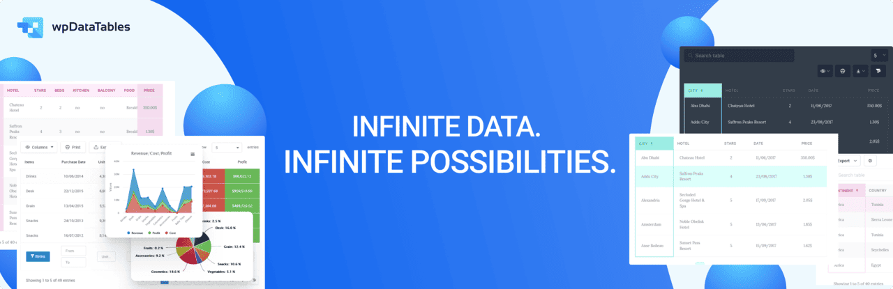
If you have a WordPress website and you’re looking to integrate it with Google Sheets, wpDataTables is your perfect match! This plugin empowers you to effortlessly manage data and create fully customizable tables and charts.
Who says that working with tables has to be boring? Tables, charts, and data management have never been easier than with the wpDataTables plugin and its Google Sheets integration. Setting up integration is a breeze, even for users with limited technical skills. You also get an intuitive setup wizard that guides you through the entire process step by step.
What sets this Google Sheets Integration WordPress plugin apart from the rest is its extensive library of resources aimed to help you manage everything easily.
Once you integrate wpDataTables with Google Sheets, the real-time data synchronization is impressive. Any changes you make in Google Sheets are instantly available on your WordPress website. You also have full control over your data, making sure that only authorized users can see it and make changes. You can even skip certain columns or add new ones and edit the data at any point.
The true power of wpDataTables lies in the combination of basic and advanced features it offers, and how easy it is to take advantage of both. You can create charts using Creation Wizard and also group similar rows.
With an impressive number of add-ons and a fantastic feature-to-cost ratio, it’s no wonder that wpDataTables is one of the favorite Google Sheets Integration WordPress plugins.
Key Features:
- Conditional formatting
- Customizable tables
- Advanced filtering
- Making dynamic SQL Queries with placeholders
- Row Grouping
- Pre-filtering tables through URL
- Calculating totals for columns
- Scrollable
- Editor input types
- Allowing users to see and edit only their own data
Price:
Annual subscription: Starting from $55 for one domain.
Lifetime: Starting from $210 for one domain.
2. Chart.js
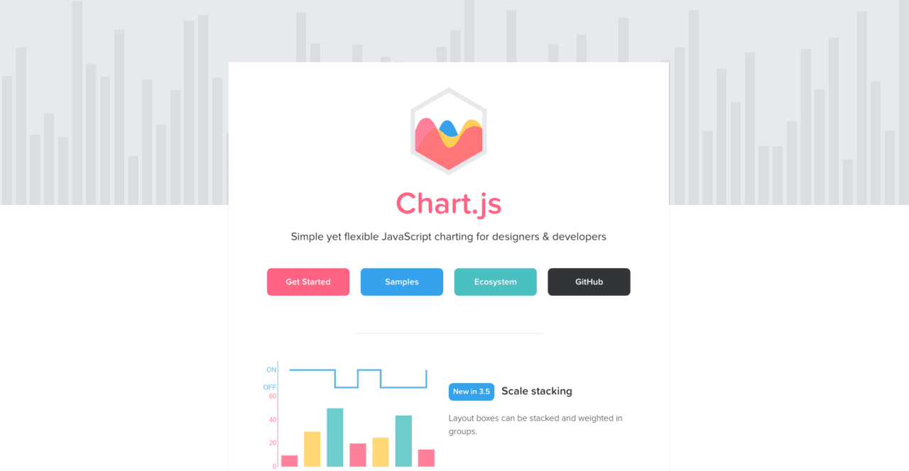
Chart.js is a data visualization tool with a rather small library of resources, but it does its job quite well nonetheless. It can display six different types of charts: bar, line, radar, doughnut, pie, and polar. Even if it doesn’t have a lot of customization options, these basic chart styles are sufficient for most people. This makes it a great option for smaller projects or simple data.
The charts created in Chart.js are rendered using HTML5 canvas components. All of the charts are responsive and have an attractive flat style. Even though it is a modest piece of open-source software, it is one of the most well-known. So, if you’re looking for something that’s simple and free, Chart.js is a great choice.
3. FusionCharts

FusionCharts comes with the most comprehensive chart and map collection on the market. You’ll find everything you need straight out of the box with over 90 chart types and 965 maps. It not only works with contemporary browsers but also with older browsers dating back to Internet Explorer 6.
FusionCharts can output charts in PNG, JPEG, SVG, or PDF, and it supports both JSON and XML data formats. For inspiration, they feature a fantastic assortment of business dashboards and live examples.
Their charts and maps are extremely configurable and offer stunning interactivity that operates across all devices and platforms. However, one thing to remember with FusionCharts is that it is a little pricey, and that’s the only reason why it didn’t take the number one spot.
4. ChartStudio
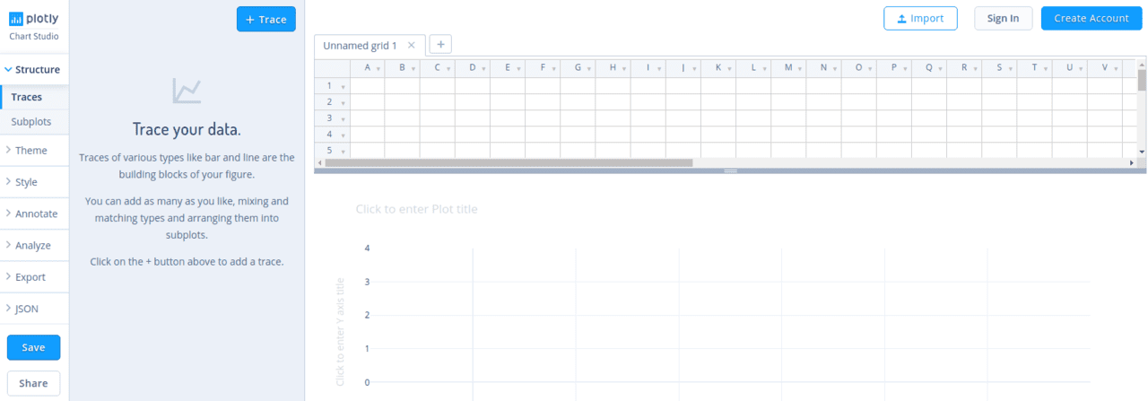
Plotly’s Chart Studio is a robust web-based online chart maker. It’s one of the most advanced D3.js and WebGL chart editors available. The version we’re recommending today is a simple one that is completely free to use. However, if you need something more comprehensive, Chart Studio does offer more advanced paid-for cloud versions that work better for enterprises.
To create a chart using this tool, all there is to do is simply drag & drop data files or use the Falcon SQL client to connect to SQL. Then just fiddle around with the settings to ramp up the aesthetic appeal.
5. Tableau Public
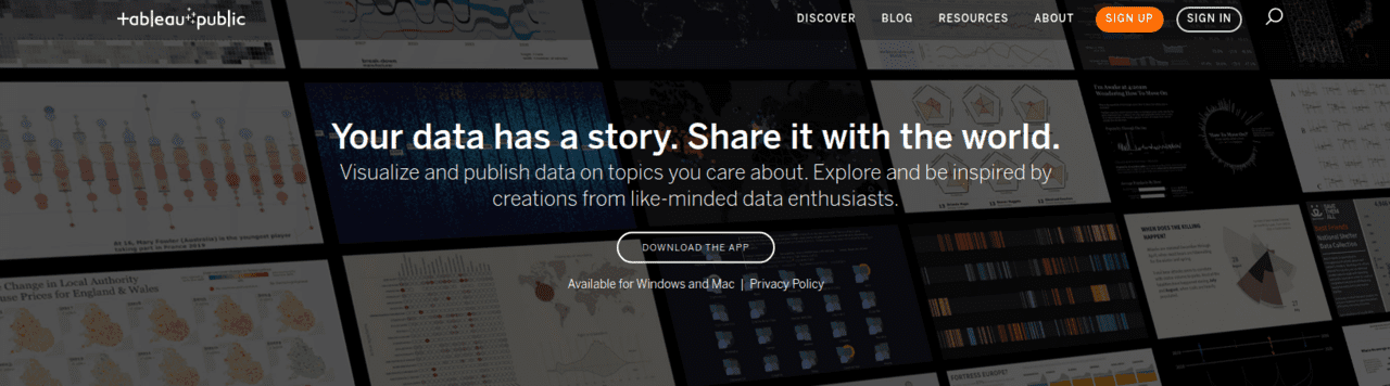
Tableau Public is one of the most popular chart-making and data visualization tools on the market among noncoders. It has a lot of graphs, charts, maps, and other graphical elements. The program is completely free, and the graphs can be added to any website. When you visit their website, you’ll find a gallery with a nice collection of Tableau visualizations.
This software’s charts and visuals are far superior to those of most of its competitors. The main disadvantage of the free version is that everything you create will come with a large watermark in the footer. If you want to avoid this, you’ll have to upgrade to the premium version.
6. Highcharts
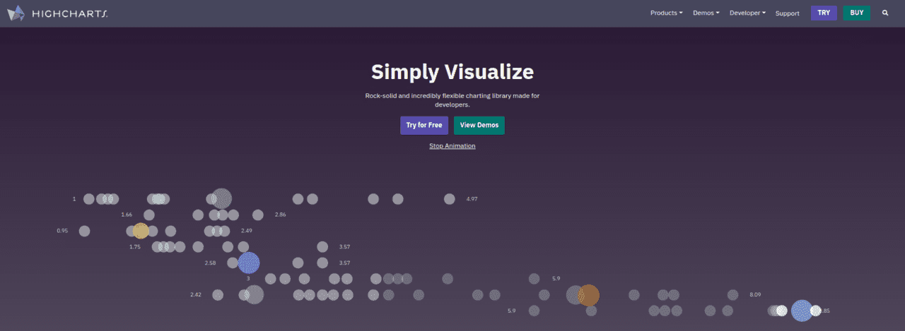
Highcharts is a widely known tool in the industry. It, too, comes with a wide choice of charts and maps straight out of the box, similar to FusionCharts. Aside from standard charts, it also has a separate package for stock charting called Highstock, which has a lot of features.
Charts created in this program can be exported in PNG, JPG, SVG, and PDF formats. Highcharts is free for non-commercial and personal use, but you’ll need to purchase a license if you want to use it for business purposes.
7. Chartbuilder
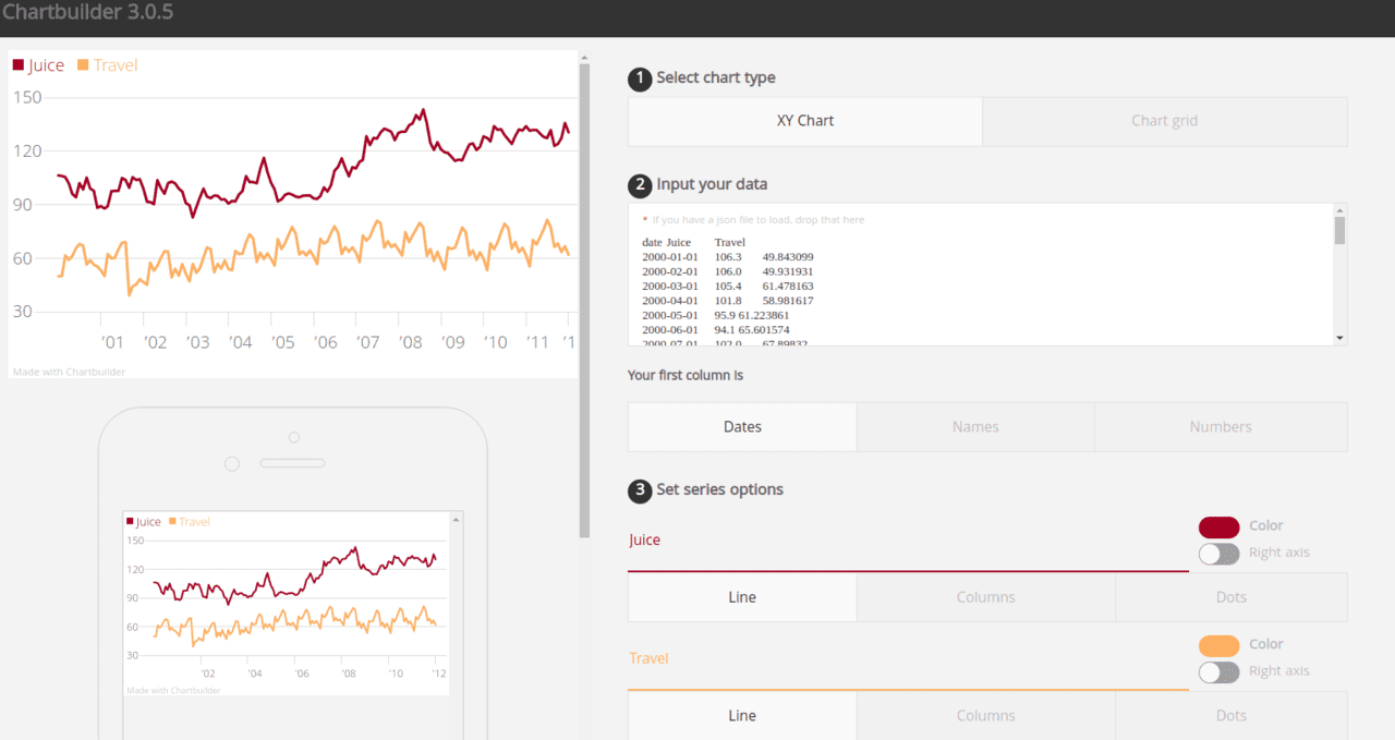
Chartbuilder is a front-end charting program that makes the creation of visually appealing charts easier than ever. Chartbuilder, however, is not a tool for data analysis or transformation. It just generates charts in a predetermined manner. In that sense, it’s similar to Chart.js as it’s mostly a simple tool used by those that don’t require much customization and don’t really care to bother with creating them much.
Generating a chart with Chartbuilder is really easy, though. All you have to do is paste data from a CSV or TSV file into and export the code to create a responsive mobile chart or a static SVG or PNG chart.
Final Thoughts
Data becomes much more accessible when visualized via a chart or a map. Implementing charts into your meeting can therefore help the entire team get a better grasp of the numbers and leave the office feeling like they know exactly what’s going on.