
WordPress’s popularity spike has been no secret (nor a surprise). It is the to-go platform for creating a website, and for a good reason. WordPress is simple to use, has a wide range of themes and site options, and also you can combine it with a plethora of plugins to enhance the user experience.
So, if you are amongst the people who are using WordPress, you are probably familiar with the new editor. Although the WordPress classic editor was helpful, it was far from perfect. That is why WordPress took the plunge and adopted Gutenberg, also known as The Block Editor.
The change has caused mixed reactions within the WordPress user community. Some are for it, and others are against – you know how it goes.
However, one should not cast judgment lightly. With WordPress more and more web designers are thinking about turning to Gutenberg.
So, what is the deal? Follow us as we go over Gutenberg’s offer, functions, and options, and try to figure out why this block editor has gotten so much attention.
What is Gutenberg?
As we welcomed WordPress 5.0, the largest update this platform has had in years, we also said hello to Gutenberg. The block editor, released as a replacement for the classic editor (as previously mentioned), is now at the heart of WordPress.
It is intended to be an entirely new way of using WordPress. Before its integration, Gutenberg was a separate plugin (which is still in active development). Does that matter? It does, trust us, and we will come back to that.
The primary goal of incorporating Gutenberg into the core of WordPress was to make creating rich content in WordPress more enjoyable. Since its initial release in 2018, it has received numerous bug fixes and enhancements and the addition of new features.
As for its appeal amongst web designers, the block editor has been improved significantly lately and is eliminating more and more advantages that page builders offered earlier.
Why “The Block Editor”?
Gutenberg has many names amongst WordPress users. There has been a healthy debate about referring to it since its release. Because the project that has born fruit to this editor was called Gutenberg, many users simply went with the Gutenberg Editor.
Others prefer to call it the block editor since Gutenberg allows you to take posts or blogs and break up their content into numerous blocks. For example, you can have:
- the paragraph block (the structure block of all narratives),
- the image block (insert an image),
- the quote block (add visual emphasis to quoted text),
- audio block (embed a simple audio player), and more.
There are over twenty-one default blocks available for the Gutenberg editor. And with block patterns, Gutenberg might become a full-on page builder. As it turns out, the sky indeed is the limit. Still, a question arises: is the block editor also a good option for mobile responsive web design?
Gutenberg and Mobile Responsive Web Design

When it comes to mobile web design, that is still a sore topic for many. It wasn’t long ago that opening a website on your phone was a nightmare. Mobile sites seemed to be an afterthought for their web designers at times. Those days, however, are long gone.
If you do not go by the rules of mobile-first indexing, your site may as well not exist. It certainly does not if you ask search engines. In a world ruled by smartphones, your website being mobile responsive is not a perk but a must. So, how does Gutenberg fare with that?
The good news is – Gutenberg enables you to stack content on smaller screens, which is a huge step forward compared to what most page builders do. They usually allow you to hide/show elements on different screen sizes.
While this looks nice on the front end, it generates a lot of code (including duplicate content, which is bad for SEO). It is also particularly time-consuming for the web designer. And negative SEO combined with a ton of wasted time is a nightmare.
The less-good news is that Gutenberg offers not many more responsive options to its users. So, the only option you have is to use CSS or similar if you need more responsive options.
Even if these issues arise, they are not the end of your Gutenberg journey. There are a few third-party tools that can assist you. You have several options, such as Editor Plus, MBM Gutenberg Blocks, or Responsive Gutenberg Blocks Library.
However, after getting familiar with Gutenberg, we have our recommendation. A tool we can highly suggest in terms of responsive web design with Gutenberg is GREYD.SUITE. Let us show you why.
GREYD.SUITE
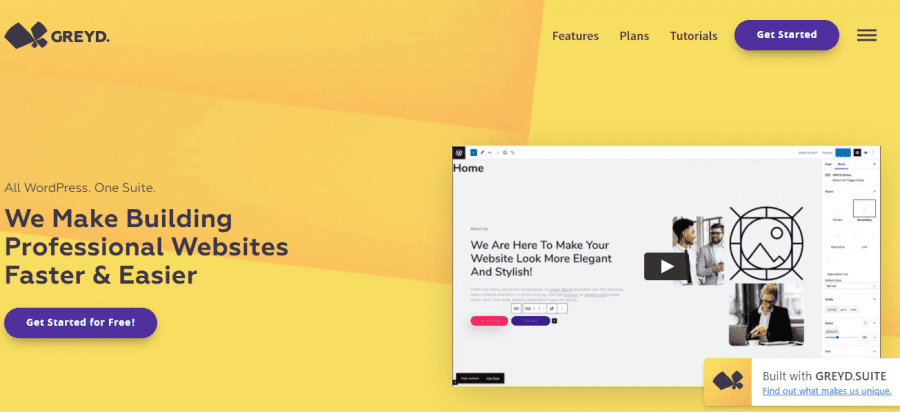
When you are looking for a third-party tool to use, compatibility matters, that is simple logic. But, when it comes to the Gutenberg tools at your disposal, there is something even better than perfect compatibility. And that, our friend, is native integration.
You see, GREYD.SUITE is a tool that was not created to be just compatible with Gutenberg. No, with GREYD.SUITE, everything is integrated.
GREYD.SUITE not only is an all-in-one WordPress suite based on Gutenberg, but it also enhances the native responsive features of the block editor by a lot.
Examples
- GREYED.SUITE lets you define widths, heights, spaces, etc. of almost any block for four different breakpoints individually (without having to duplicate any content)
- It works with an integrated 12-columns Bootstrap grid that makes designing responsive websites easy.
- You can layout columns individually for four different breakpoints, including offset, order, and size options per breakpoint, and you can hide elements for different screens with a single click.
- You can even customize these four breakpoints if you want to.
However, this tool does not stop there. Along with the fact that it helps you create responsive websites, you get many features at your disposal.

Features
- Interfaces & Integrations: GREYD.SUITE delivers native interfaces to the most popular business tools on the web. You can transmit data from your shop or your forms to your CRM or connect your newsletter tool to the forms on your site. They exist to make sure you can reproduce your business model easily and flexibly online.
- Template & Pattern Library: Time is a privilege, and you can save some by choosing from their themes, templates and patterns when building forms, popups, or entire websites. You will save even more time using their dynamic templates. Oh, and personalization, anyone? Everything, from layout to design, is entirely flexible and adjustable to your preferences.
- Forms: You will not need a form builder plugin ever again. Build everything – from simple contact forms with double opt-in to complex multi-level forms, connect them to your CRM, add calculations or conditional logic. It is fast and effortless with GREYD.Forms.
- Hub: Managing multiple websites is a breeze when you can do it from a single dashboard. Have access to all your client websites, manage key settings, and create bulk backups in just a few clicks.
If you do not feel like committing right now, you can always head to their site and download the free demo.

That way, you will access all of their features and see if the tool is right for you. Should you decide that it is, there are four plans available: For Beginners, For Savers, Most Popular, and For Heavy Users. So, whatever your need is, they have a plan to cover it.
Do You Have to Go for Gutenberg?
At this stage, you do not, but you should. WordPress still offers some way to switch back to their classic editor. So, you can do just that. However, this puts you at a significant disadvantage.
Gutenberg’s creators work every day to improve its functions, implying that it will only grow in popularity. So, you’ll have to visit Gutenberg sooner or later, and we recommend sooner.
Conclusion
Even though Gutenberg is a relatively new core addition to WordPress, it is already miles ahead of its previous editor. There are still some kinks to work out, as with anything new. Those, however, will be resolved over time.
Fact is – Gutenberg is the future. Not only for WordPress but for mobile web design in general.
Remember that separate plugin we mentioned? You can download that to get acquainted with upcoming Gutenberg features – before they get added to the core platform.
Combining Gutenberg with a third-party tool like GREYD.SUITE opens up a whole new world for responsive mobile web design. And responsive mobile web design plays a role in everything, especially SEO optimization.
These days, Google is not kidding when it comes to that. If you want to appeal to search engines, you should consider responsive mobile web design.
Of course, GREYD.SUITE is not the only tool you can get, but it is the only one with native Gutenberg integration, which sets it ahead of the competition. So, if you are planning to stay with WordPress, it is due time to familiarize yourself with Gutenberg. You will thank yourself later, and your site will thank you too.