Better Text Widget adds a small improvement to text widgets in WordPress. It adds a…
Responsive is the wave of the future, we all know that by now. There are plenty of ways to make your widgetized sidebars responsive, but Responsive Widgets give you the ability to show and hide content based on viewport width.
What’s it Do?
Responsive Widgets adds several new widgets to the WordPress admin. Each one is a text widget corresponds to a different device size (mobile, desktop, iPhone, etc.), and can be dragged into any sidebar on your site. Any content that you include in these widgets will only be seen when the viewport size matches the widget. Otherwise, the content will be hidden. The plugin uses media queries, not device detection, to accomplish its goal, so it’s reliable across different devices and browsers.
How’s it Work?
After you install and activate your plugin, you can see your new widgets by going to Appearance -> Widgets. All of the new widgets correspond to a specific width that you would like to target. For instance, the “Desktop” widget will show content to viewports larger than 1030px. The Mobile widget, on the other hand, will only show the content of the widget to devices smaller than 481px. There are also more device specific media queries meant to target iPads, iPhones, Windows Phone, etc. The full list of available widgets is Large, Mobile, Tablets, Phablets, Desktop, iPad (landscape), iPad (portrait), iPhone5 (landscape), iPhone5 (portrait), Kindle Tablets, Nook Tablets, Nexus Tablets, Windows Phone OS, PlayStation Vita, Samsung, and Surface Tablets. So, lots to chose from.
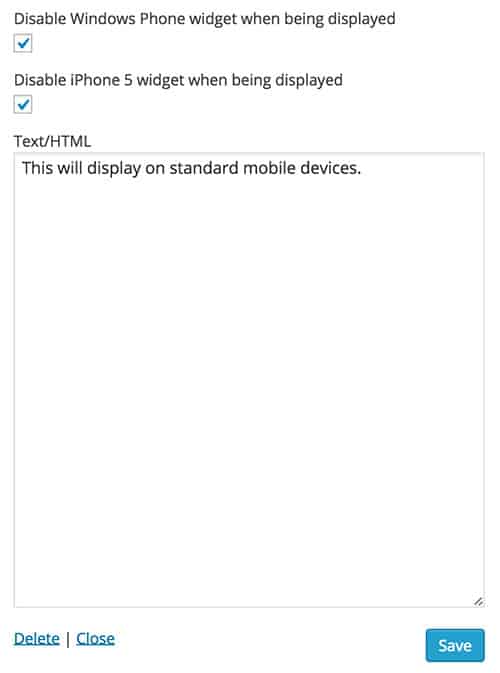
The Mobile responsive widget
To use any of these widgets, just drag them to the sidebar. The content of the widget can contain any text or HTML, and other then it targeting specific device sizes, it works the same as the default “Text” widget. For overlapping sizes, there are also options to disable other widgets while the content is in view. For instance, if you select the “Mobile” widget, you can also disable the iPhone and Windows Phone widgets whenever it is shown so that you do not have overlapping options.
Everything works with a small bit of CSS and “display: none”, so it’s safe to use just about anywhere, and can be helpful in certain situations.
Costs, Caveats, Etc.
This is the first release of the plugin, but it works very well. What I’d like to see is the ability to turn off certain widgets, and add your own custom sizes. Hopefully, features like this will be rolled out in the future. If you have any questions about the plugin, you can visit the support forums.